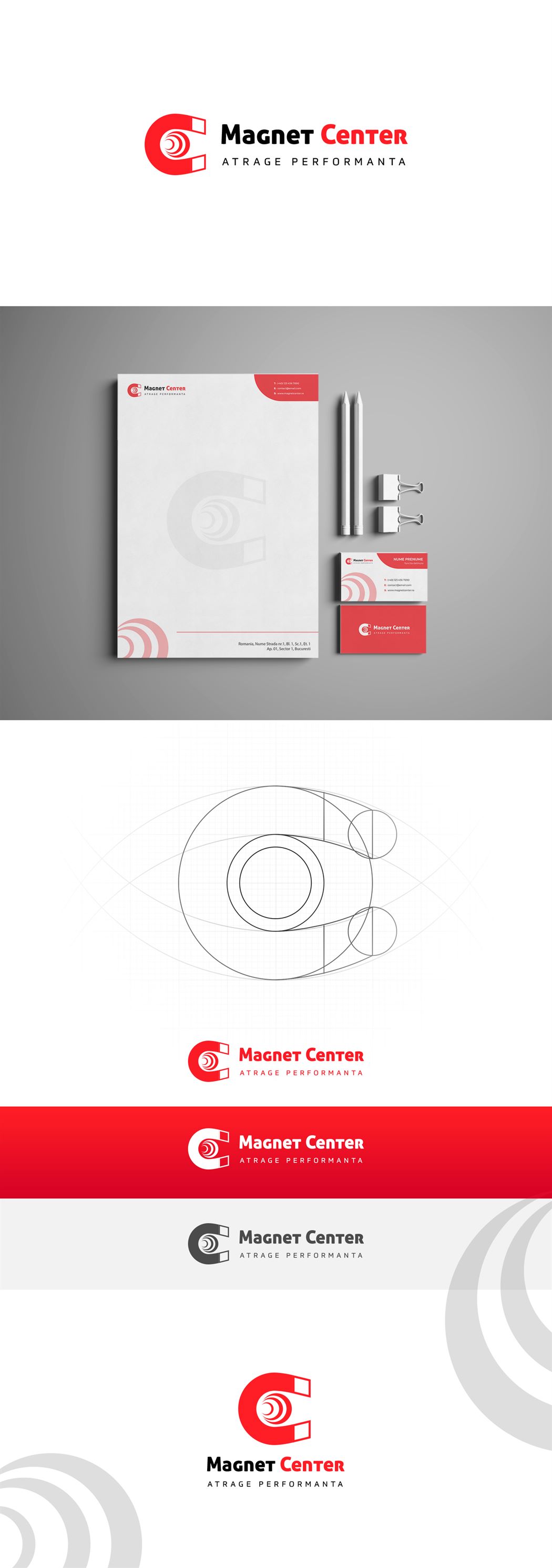
The Magnet Center partners wanted a slightly stylized rebranding, here the Creative Ones artists came in. In order to select the target audience attracted by the guaranteed performance of the professional products offered by Magnet Center, the creation of the new logo representing its business or was based on principles such as::
- quality
- performance
- professionalism
- persuasion
The geometric shapes used are reminiscent of the attraction between two opposing poles, but with a common integrated element. The chrome continues the previous line, which identifies itself with the existing brand image. It has the role of positively differentiating itself from competition.